When it comes to cryptocurrency trading, candlestick charts are one of the most powerful tools traders can use to make informed decisions. But if you're new to trading or investing, these charts may look daunting at first glance. The good news? Once you understand the basics and know what to look for, candlestick charts become an intuitive way to analyze market trends and price movements.
This blog will guide you through everything you need to know to read candlestick charts. From understanding their structure to identifying popular patterns and combining them with indicators, you'll leave equipped to better interpret market behavior and make confident trading decisions.
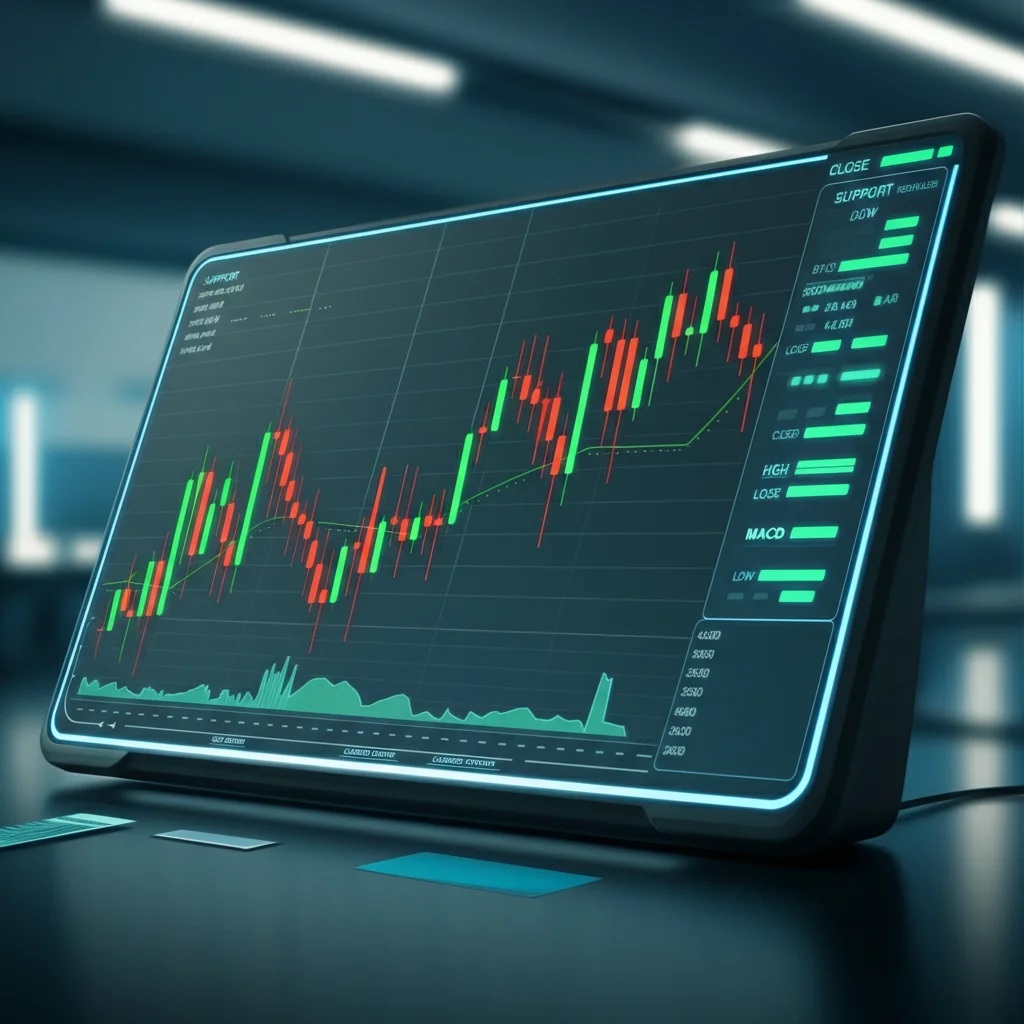
What Are Candlestick Charts?
Candlestick charts are a visual representation of price movements over a specific time period. Originally developed by Japanese rice traders in the 1700s, they've become a staple in financial markets, including cryptocurrencies.
Each "candlestick" encapsulates the open, close, high, and low price of an asset during a chosen time frame (e.g., 1 minute, 1 hour, 1 day). Unlike line charts, candlestick charts provide deeper insights into market sentiment by showing whether buyers or sellers controlled the market during that period.
For traders, candlestick charts offer a clear, concise picture of price trends, making them essential for technical analysis.
Anatomy of a Candlestick
To read candlestick charts effectively, you need to understand the anatomy of each candlestick. Here's a breakdown of its main components:
1. Open Price
The open price is where the asset's price was at the start of the time frame.
2. Close Price
This is where the price settled at the end of the time frame. If the close price is higher than the open price, the candlestick is typically green (signaling a bullish movement). If the close price is lower, the candlestick is red (indicating a bearish movement).
3. High Price
The high price is the maximum point the asset traded during the time frame.
4. Low Price
The low price represents the lowest traded value of the asset for the period.
5. Body and Wicks
The body of the candlestick is the section between the open and close prices, while the wicks (or shadows) extend vertically to indicate the high and low prices.
Understanding this simple structure allows you to quickly evaluate market behavior at a glance before digging into patterns or trends.
Popular Candlestick Patterns
Candlestick patterns arise from the interaction of multiple candlesticks and can signal potential market reversals or continuations. Below are a few popular patterns every trader should know:
1. Doji
A doji forms when the open and close prices are nearly identical, creating a very small or non-existent body. It represents market indecision and could signal a reversal if followed by a strong price action.
2. Hammer
The hammer pattern appears at the bottom of a downtrend and features a small body with a long lower wick. It suggests that sellers dominated early in the session, but buyers regained control, signaling a potential reversal upward.
3. Engulfing Patterns
A bullish engulfing pattern occurs when a green candlestick completely "engulfs" the body of the previous red candlestick, signaling a shift to upward momentum. Conversely, a bearish engulfing pattern does the opposite, indicating potential downward movement.
4. Shooting Star & Hanging Man
The shooting star appears at the top of an upward trend, pointing to a potential reversal downward. Its body is small, and it has a long upper wick. The hanging man is its opposite, signaling a bearish trend reversal.
Recognizing these patterns takes practice, but they can be incredibly useful for spotting opportunities in the market.
Support and Resistance Levels
Support and resistance levels are key price points at which the asset struggles to move below or above, respectively. On candlestick charts, repeated tests of these levels often manifest as reversal patterns.
Support Level: Found at the bottom of a trend. If price repeatedly "bounces" from this level, it suggests strong buyer interest.
Resistance Level: Located at the top of a trend, where prices repeatedly fail to break through, showing strong selling pressure.
When candlesticks approach these levels, they provide critical clues about whether the price is likely to break through or reverse direction.
Combining Candlestick Charts with Indicators
Candlestick charts are powerful on their own, but pairing them with technical indicators can further sharpen your analysis. Here are three indicators to use alongside candlestick analysis:
1. RSI (Relative Strength Index)
The RSI helps identify whether an asset is overbought or oversold. For example, if RSI shows oversold conditions and a bullish candlestick pattern like a hammer forms, it strengthens the case for a price reversal upward.
2. Moving Averages
Overlaying moving averages on a candlestick chart allows you to spot trends or determine dynamic support and resistance levels. A bullish crossover of shorter and longer moving averages can confirm upward momentum.
3. MACD (Moving Average Convergence Divergence)
MACD measures momentum and can confirm trends identified on candlestick charts. Look for divergences or crossovers to validate bullish or bearish patterns.
By combining candlestick charts with indicators, your analysis becomes more nuanced and reliable.
Reading Volume Trends
Volume adds another layer of insight when analyzing candlesticks. A price movement backed by high trading volume typically indicates stronger conviction than one with low volume. For instance:
A bullish engulfing pattern with high volume is more significant than one with low volume.
A breakout above a resistance level paired with a surge in volume shows strong buyer interest.
Paying attention to volume ensures your interpretations are grounded in market activity.
Tips for Beginners
Reading candlestick charts takes time and practice. Here are some tips to help you get started on the right foot:
Start with Longer Time Frames
Daily or weekly charts are generally easier to interpret than shorter timeframes like 5-minute charts, which can be noisy.
Master Basic Patterns First
Don’t overwhelm yourself by trying to learn every candlestick pattern. Focus on recognizing a few key patterns, such as hammers and engulfing patterns, before expanding your knowledge.
Backtest Your Strategy
Practice identifying patterns by looking at historical charts. Note how often certain patterns led to successful predictions and refine your approach accordingly.
Avoid Overtrading
Just because you see a candlestick pattern doesn't mean you need to act immediately. Be patient and wait for confirmation from indicators or volume trends.
Educate Yourself Continuously
Crypto markets are constantly evolving. Staying updated on new tools, strategies, and patterns will help you remain competitive.
Start Trading with Confidence
Candlestick charts are an essential tool in the crypto trading world, offering valuable insights into price trends, market sentiment, and future price action. By understanding their anatomy, recognizing patterns, and combining them with other tools like indicators and volume analysis, you can make more confident trading decisions.
Remember, every expert was once a beginner. Take your time, practice, and continue to learn. With consistent effort, you'll soon master the art of reading candlestick charts.
If you’re ready to step up your crypto game, explore our full tutorial library or sign up for advanced live webinars with trading pros!